Project Overview
Creating a personal brand is always a journey of self-reflection, but for me, designing the Kelly De Luca Design & Co. brand became a deeply personal tribute and a statement of resilience. With over 20 years in brand and graphic design, I needed an identity that not only showcased my expertise but also honored my roots and celebrated new beginnings.
The Challenge
My brand identity needed to:
- Prominently feature my last name, De Luca, as a tribute to my family heritage
- Incorporate personal symbols of growth and continuity
- Reflect my design aesthetic while nodding to my love for financial empowerment
- Create a versatile system that works across various platforms and mediums
The Process
Discovery: Reflecting on Roots and New Beginnings
As I began this process, I found myself reflecting deeply on my personal journey. The passing of my dad last Christmas brought into sharp focus the importance of family legacy. I remembered his words encouraging me to “focus on work that you love,” and I knew this brand would be a testament to that advice.
The ampersand, a symbol I had tattooed on my ankle after my divorce as a reminder that there’s always more to life, became a central element in my thoughts. It represented continuity, growth, and the endless possibilities that lie ahead.
Conceptualization: Blending Personal Symbolism with Professional Expertise
With these personal elements in mind, I began sketching concepts that would bring together my name, the ampersand, and visual representations of design and balance. I wanted to create something that felt both personal and professional.
Design Development: Crafting a Visual Language
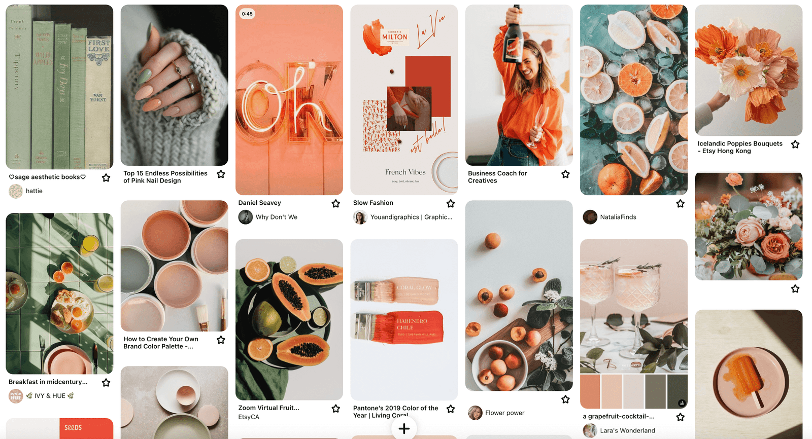
As I refined my concepts digitally, I gravitated towards a color palette that reflected both my personal tastes and the brand’s sentiment:
- Sage green, my favorite color, representing growth and renewal
- Coral, adding a vibrant, energetic touch
- Sunset orange, warm and inviting, symbolizing new horizons
These colors not only pleased my aesthetic sense but also created a unique combination that stood out in the design and finance spheres.
Finalization: Bringing It All Together
The final stage involved creating a comprehensive brand system that could flex and grow with my business while always remaining true to its roots.
The Solution
The Logo
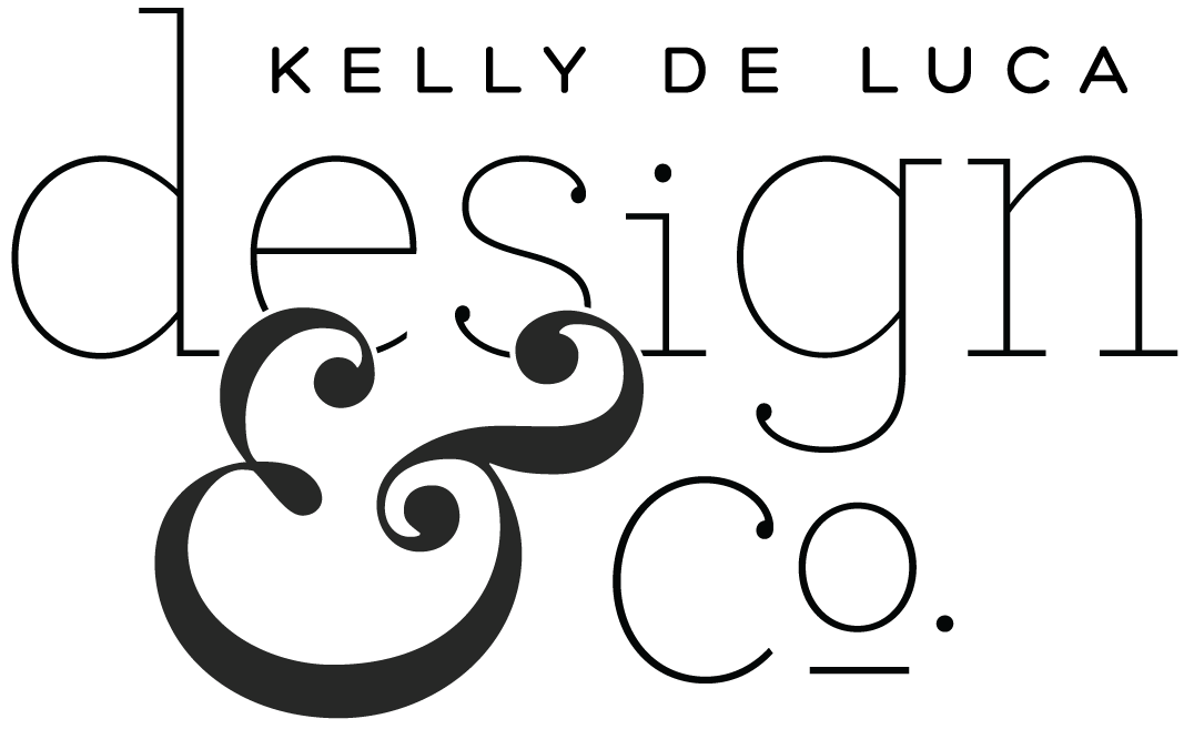
The final logo for Kelly De Luca Design & Co. prominently features my last name, De Luca, honoring my family heritage and my father’s memory. The ampersand takes center stage, not just as a grammatical conjunction, but as a personal symbol of continuity and endless possibilities.
The typography is clean and modern, reflecting professionalism, while the stylized ‘i’ and ‘o’ form an visual interest making it more unique.
The Brand Board
Color Palette
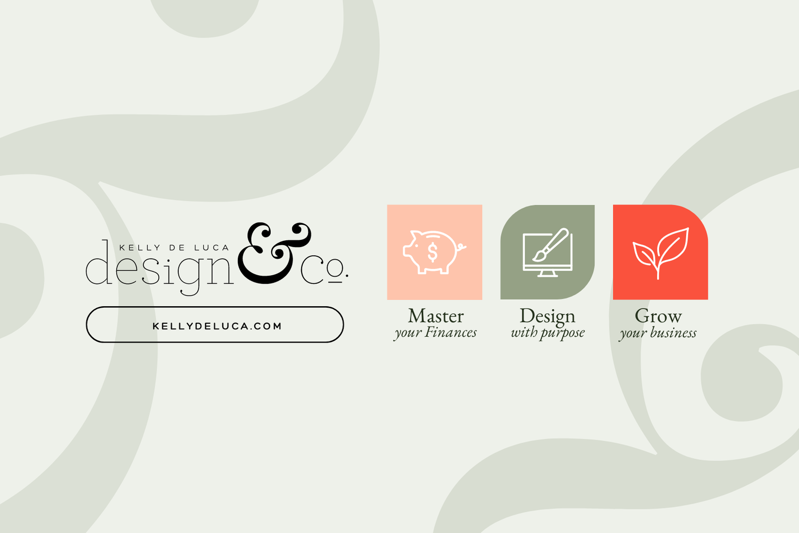
- Sage green: My favorite color, representing growth and the foundational nature of good design
- Sunset orange: Warm and inviting, symbolizing the new horizons we help our clients achieve
- Coral: Adding vibrancy and energy, reflecting the excitement of creative work
Typography: A pairing of a sleek sans-serif for headings and a readable serif for body text, balancing modern design with timeless elegance.
Secondary Graphics: Abstract patterns inspired by the ampersand, financial graphs, and design grids, reinforcing the brand’s dual focus on design and financial empowerment.
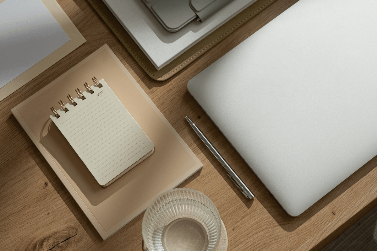
Image Style: Bright, clean imagery focusing on workspaces, design tools, and financial elements, always with a personal, relatable touch.

The Impact
This brand identity has become more than just a professional logo—it’s a daily reminder of my journey, my father’s advice, and my commitment to helping others through design and financial empowerment. It has:
- Create a strong emotional connection with clients through the brand’s personal story.
- Reinforced my unique positioning at the intersection of design and finance
- Provided a flexible system that grows and adapts with my business
Closing Thoughts
Creating this brand was a profound experience in visually articulating who I am and what I stand for. It reminded me that the most powerful brands are those rooted in authentic stories and genuine passions. Through this process, I’ve not only created a brand I’m deeply proud of but also strengthened my ability to guide clients in uncovering and expressing their own unique brand stories.
Now I won’t lie…. designing for yourself is extremely tough, like they say we are our worst clients. But happy I can file this in the done pile. 🙌🏼
Ready to create a brand that truly tells your story and sets your business apart? Let’s work together to design an identity that resonates with your journey and your audience. Contact me to begin your branding adventure!

0 Comments