Sweet Simplicity : Farine & Chocolat
Vintage-Modern Branding for an Artisanal Bakery
Farine & Chocolat, a bakery specializing in cakes, cupcakes, and sweet tables, sought a brand identity that would reflect their artisanal approach and delightful offerings. Our challenge was to create a visual language that blended vintage charm with modern simplicity, appealing to both traditional pastry lovers and contemporary dessert enthusiasts.
Solution
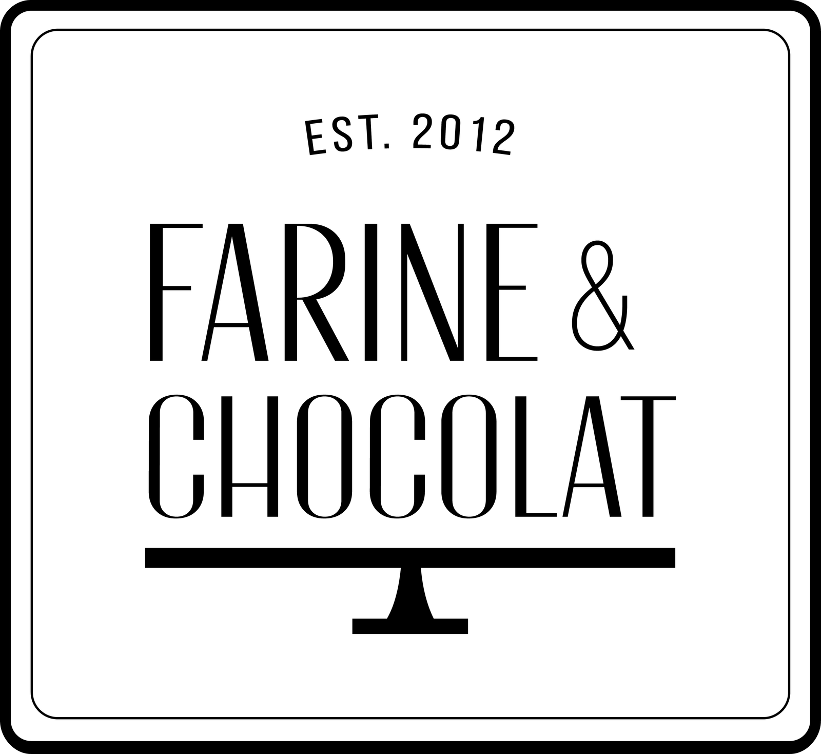
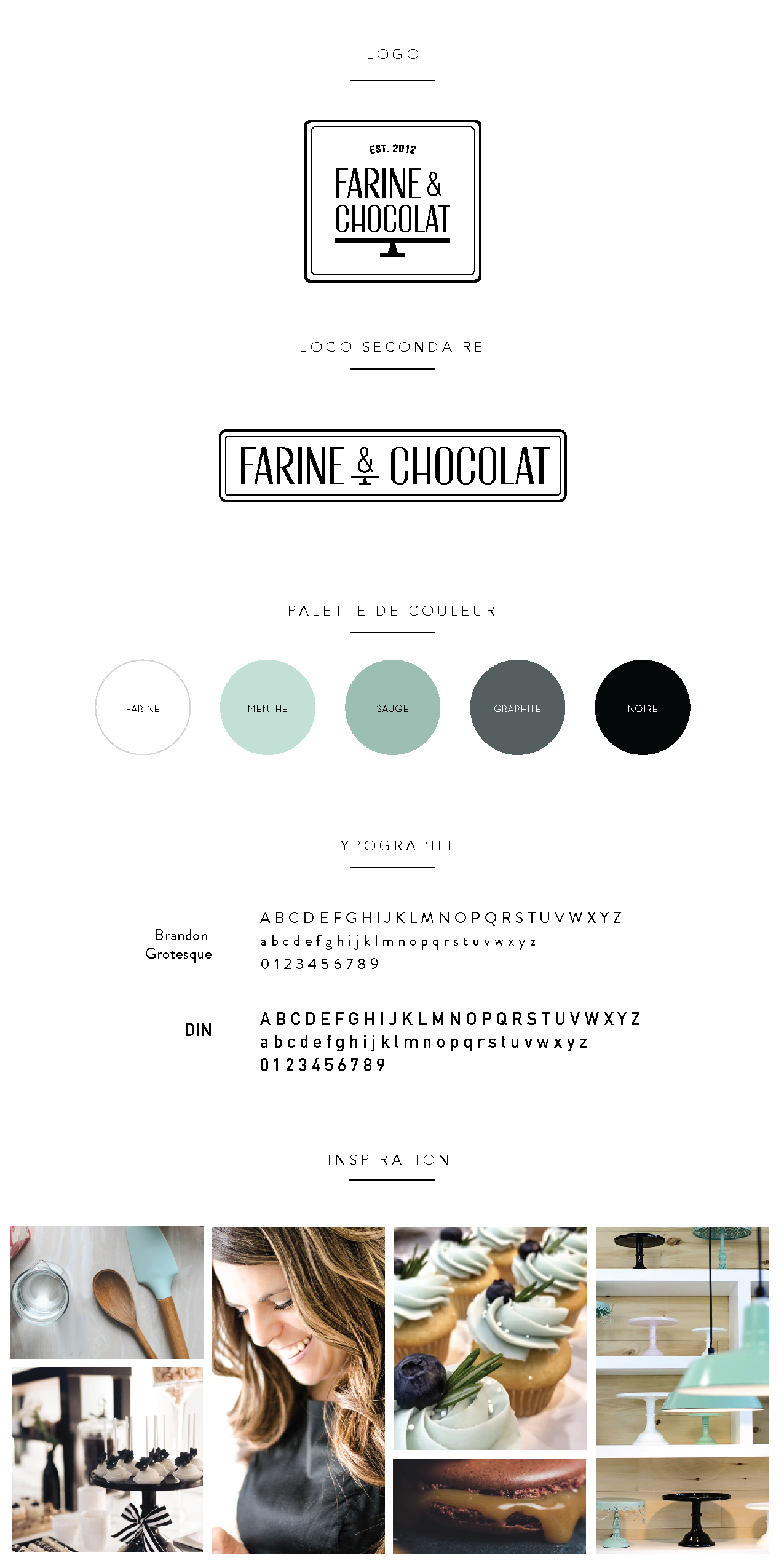
We crafted a brand identity that captures the essence of Farine & Chocolat’s delectable creations and their commitment to quality. The centerpiece of the design is a minimalist logo that strikes a perfect balance between vintage allure and modern aesthetics:
Typography: We selected a font with a slight vintage feel, evoking the timeless appeal of traditional bakeries while maintaining a clean, modern look.
Minimalist Cake Stand: Incorporated into the logo is a sleek, minimalist representation of a cake stand. This elegant element not only symbolizes the bakery’s specialties but also adds a distinctive and memorable visual component to the design.
Rounded Rectangle: The entire logo, including the typography and cake stand, is encased in a rounded rectangle. This softens the overall appearance and subtly hints at the shape of a cake or baking tin.
The color palette was carefully curated to reinforce the brand’s identity:
- Black: Conveying sophistication and timelessness
- White: Representing purity and cleanliness in food preparation
- Mint Green: Adding a fresh, modern twist that sets Farine & Chocolat apart from traditional bakeries
Key Deliverables
- Logo
- Brand Board
- Website Design
- Store Signage
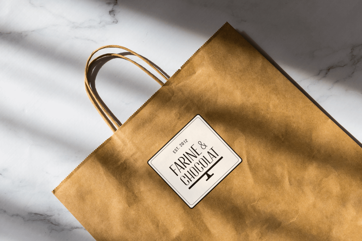
- Stickers
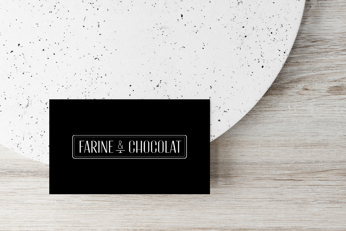
- Business Card
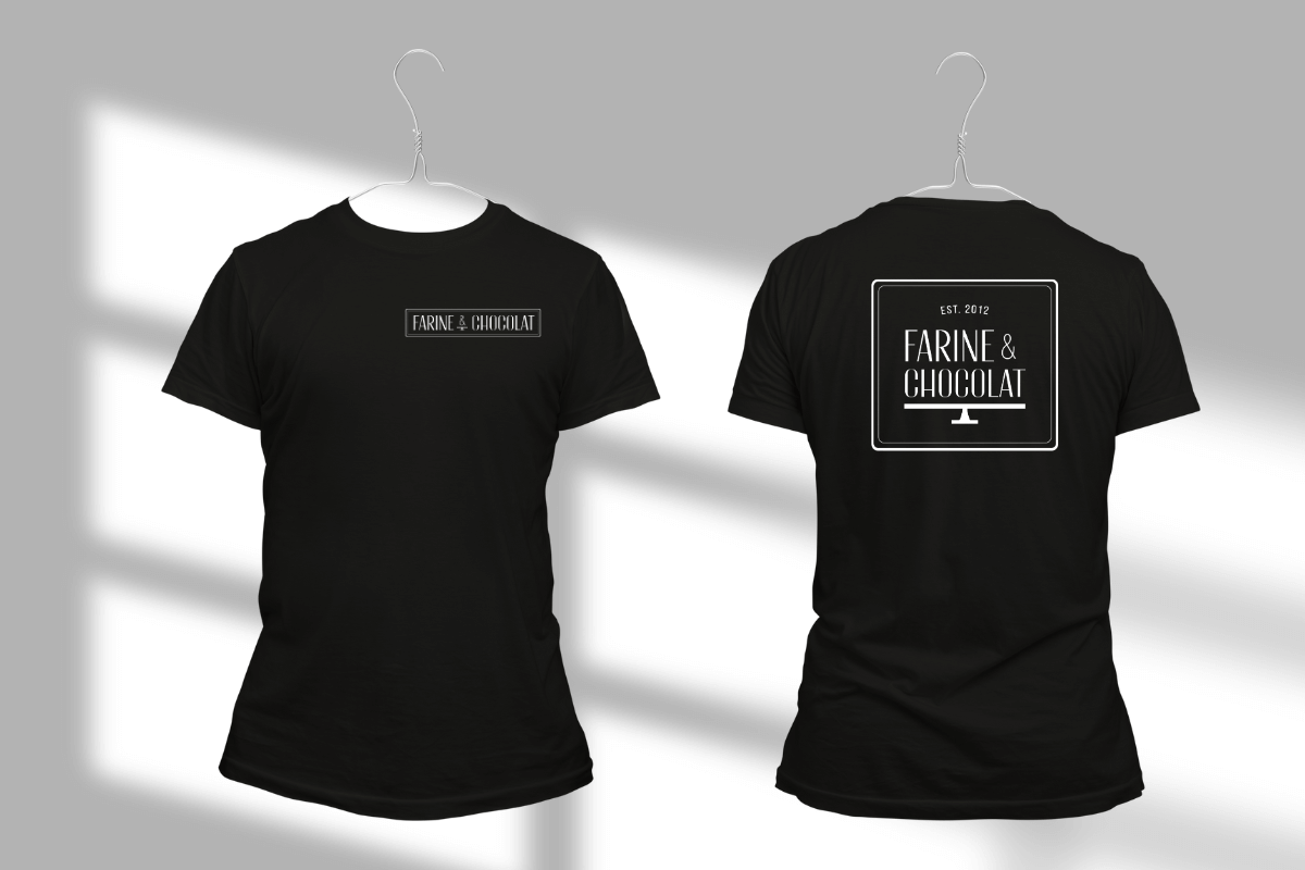
- Attire
“
