Sustainable Elegance: K2 Rénovation
Elevating a construction brand through refined design and eco-conscious aesthetics

K2 Rénovation, a leader in sustainable construction, sought to refine their visual identity as they expanded into the European market. I was tasked to refresh their logo and enhance their brand elements to reflect their commitment to eco-friendly practices and premium wood craftsmanship.

Solution
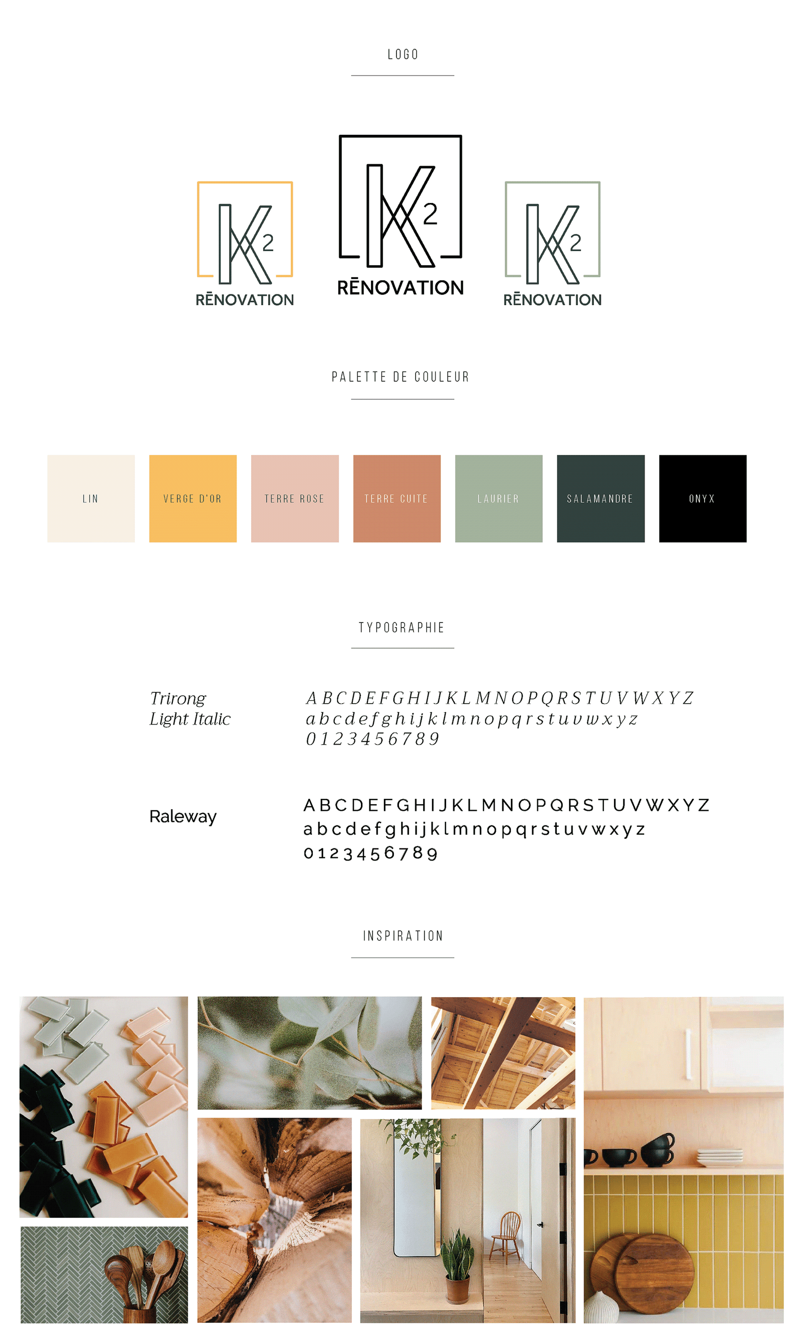
We refreshed the existing logo, enhancing its sophistication while ensuring a smooth evolution from the previous design. The refresh involved several key elements:
Font Refinement: We carefully refined the fonts used in the previous logo, maintaining brand recognition while adding a touch of modernity.
Redesigned ‘K’: We reshaped the ‘K’, overlapping its legs to resemble “un équerre” (a square or set square in English), a nod to precision in construction and design.
Symbolic ‘2’ Placement: We centered the ‘2’ at the intersection of the K’s legs,
symbolizing how the owners, Kim and Kevin, are at the core of the business. This thoughtful detail adds a personal touch to the logo, reflecting the company’s leadership and values.
Building Element: We incorporated a box element to represent a home or building, symbolizing K2 Rénovation’s core business in construction and renovation.
Key Deliverables
- Logo Refresh
- Brand Board
- Presentation Deck
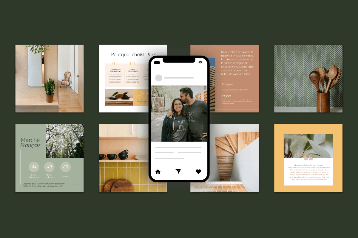
- Social Media Graphics
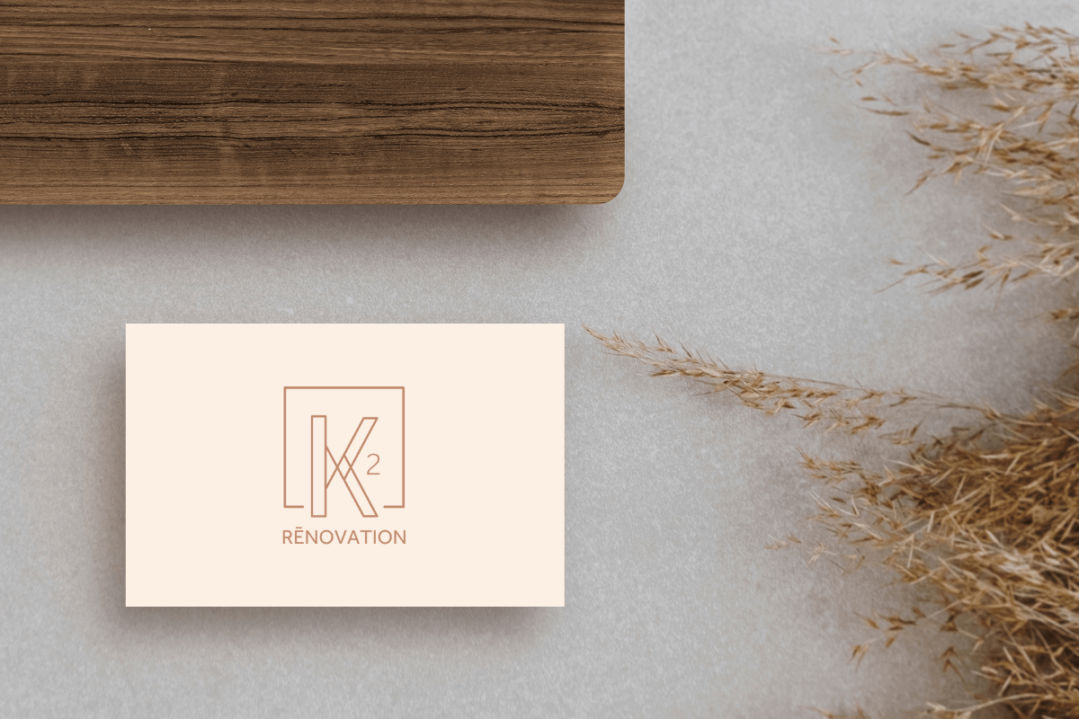
- Business Card Design
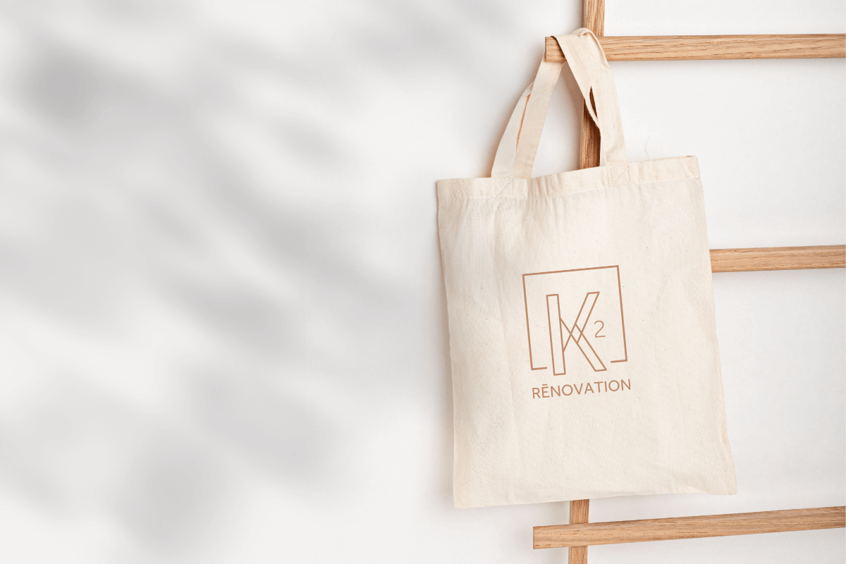
- Custom Bags & T-shirts
“
