Fishing Boat Inspired: Le Sushi Shack
Crafting a Unique Visual Identity for a Mountain-Based Sushi Restaurant

Le Sushi Shack, nestled in the picturesque town of Mont-Tremblant, sought a distinctive brand identity that would blend the freshness of sushi with the charm of old wooden fishing boats. Our challenge was to create a visual narrative that would resonate with both locals and tourists in this popular mountain resort.


Solution
We crafted a brand identity that seamlessly merges the restaurant’s culinary focus with its desired aesthetic. The design palette draws inspiration from small wooden fishing boats of warmer climates, featuring a harmonious blend of whites, pale blues, aquas, and greige/brown tones. This color scheme not only reflects the warm, coastal theme but also complements the mountain surroundings of Tremblant.
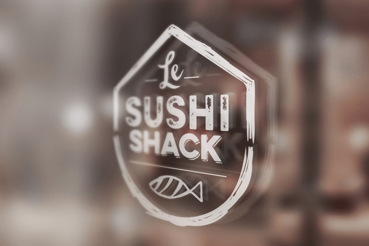
The logo design is a unique representation of Le Sushi Shack’s concept:
Two-Part Structure: The logo is split into two distinct parts, emphasizing the “shack” aspect of the restaurant.
Wood Texture: We incorporated a rough wood-like texture throughout the logo, evoking the rustic charm of small fishing boats.
Rounded Bottom: The lower part of the logo features a rounded bottom, reminiscent of a boat’s hull.
Pointed Top: The upper part of the logo has a pointed top, representing the roof of a shack.
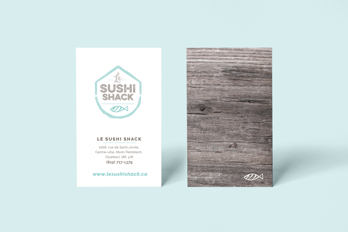
Fish Icon: Integrated within the logo is a distinctive fish icon that appears to be carved out of wood. This element serves as a powerful visual for brand recall and can also be used separately across various brand applications.
Key Deliverables
- Logo Design
- Secondary Icon
- Patterns / Textures
- Brand Board
- Business Card Design
- Shopping Bag


This project was completed while working as an Art Director at Strategies.
